Martin Margiela Exhibition
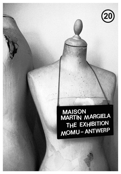
/A retrospective of Martin Margiela’s work just opened at The ModeMuseum (MoMu) in Antwerp on occasion of the 20-year anniversary of the Maison. Curated by MoMu creative director Kaat Debo in collaboration with Bob Verhelst and the Maison itself, the exhibition captures Margiela’s exacting aesthetic in its design and installation.
As is often the case with MoMu exhibitions, the strength lies in the fact that they go beyond the display of objects and incorporate installation, photography, video and film to fully convey a designer’s aesthetic. This multi-media approach makes the exhibition particularly current and engaging as fashion-as-image occupies an ever-increasing centrality in the world of fashion. (This fact was recently highlighted by Suzy Menkes’s article in The International Herald Tribune, about the proliferation of fashion films.)
The MoMu exhibition opens with a cardboard cutout representing the employees of the Maison, whose faces, like Margiela’s, remain blank and, as the exhibition text points out, thus remain incognito. It continues with a series of garments from various collections and a number of Margiela’s variation on his signature shoe: the Tabi Shoe (derived from the Japanese tabi socks). The garments and accessories in the first room are covered with a layer of silver and white paint. The abundance of silver is reminiscent of Warhol’s Factory, while the white paint—a staple of Margiela’s aesthetic—cracks alongside the garments creases and register signs of wear. Thus, in one of the first of a series of subversions, the whitewash usually employed as a way to erase aging becomes a reminder of the passage of time.
The white layer covering the garments returns in the exhibition space, which is white-washed with the exception of enlarged photographic prints of the exhibition interior superimposed on some of the walls. This superimposition is meant to remind one of the tromp-l-oeil effects that pervade Margiela’s stores, offices and garments. This technique is most evident in Margiela’s headquarters in rue Saint Maur in Paris, where photographs of their previous offices are superimposed on doors and walls to instill the “new” spaces with the history of the Maison. This complicated relation to time and history is also evident in his clothes which are often pre-aged and combine garments from different periods together with Margiela’s own past work.
Time is, in fact, one of the two main themes of Margiela’s work and it imbues the entire exhibition, but is perhaps most evident in the installation exploring Margiela’s Spring/Summer 1996 collection where he printed photographs of old clothes onto new ones. The photographs and thus the resulting prints had also been artificially aged, acquiring a sepia tone and the out-of-focus look of old black and white prints. This gave a an artificially created nostalgic, melancholic look to the new garments. The simultaneous exploration and denial of nostalgia is common perhaps to the exhibition as a whole, where enigmatic white spaces, muted colors and a lyrical aesthetic is undercut by witty subversions.
This is perhaps most evident in the collection and exhibition sections exploring the themes of the body. For instance, all white and black dress forms illustrating Margiela’s changing vocabulary become reminiscent of a frozen army in their stillness. On the other hand, enlarged collections and collections derived from doll clothes not only question standardized body size, but bring us back to a world of childhood play (the Barbie dolls) and fairy tales (the giants). A number of these clothes are in fact enlarged versions of Barbie’s clothes, which retained all the disproportion of the original. Thus, Margiela’s doll clothes appear doubly ironic, as they unveil the inherent “disproportions” of garments belonging to a model body—that of Barbie—metonymically calling into question the idealized body of the doll. Other collections which he produced at the turn of the millennium instead explore clownish proportions alongside the designer’s more common tropes of inside-out and seemingly unfinished garments.
Photo Ronald Stoops. Make-up Inge Grognard
At the end of the exhibition space there is a circular room containing fashion shows alongside fashion films and photographs, which the Maison produced throughout the year (a selection of which can also be bought at the Museum store). This is perhaps the section that most fully explicates the importance of collaboration to the Maison. The way the Margiela aesthetic has developed thanks to an array of photographers (Ronald Stoops, Anders Edström), designers (Bob Verhelst, who was also the exhibition designer), make-up artists (Inge Grognard) and countless others. Most interesting are perhaps the early videos of his work and fashion films, also because they are the least available. A short, grainy super-8 film looks much like an experimental film from the 1970s inspired by early silents and showing women wearing Margiela’s clothes while engaging in simple daily activities. Like many Margiela’s models throughout much of his career (with the exception of his most recent collections), they are often “regular” women—middle-age, young women with their children, or pregnant women. This short makes for a touching film, which encapsulates Margiela’s lyrical tone where a certain quietness and silence is cultivated, and where much remains unsaid or only lightly suggested—a rare strategy in the over-saturated world of image and fashion.
Francesca


