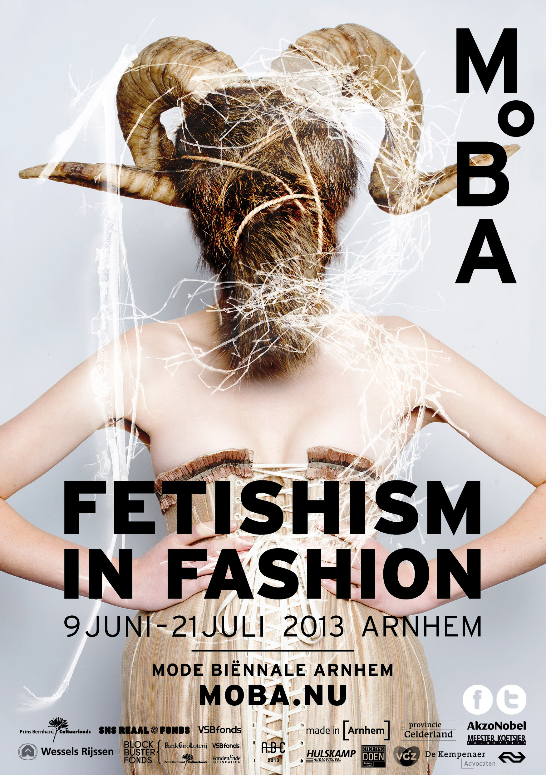
Review of Fetishism in Fashion, MOBA 2013

by Philip Warkander

“We are born in bondage, a cord wrapped around our baby body”, curator Lidewij Edelkoort stated in her introductory speech to this year’s Mode Biënnale in Arnhem, Fetishism in Fashion, open June 9 through July 21. During an interview, she tells me that the starting point of the exhibition is the trauma a child experiences after birth when it is separated from its mother through the cutting of the umbilical cord, resulting in a lifelong search after new unities to be part of. According to Edelkoort, this feeling of lack explains the charm bracelets around our wrists and crucifixes around our necks; magical substitutes for the physical connection between mother and child that was lost at birth. For the biënnale, Edelkoort has chosen 13 different perspectives on the theme of fetishes, presented in separate rooms along long corridors, ranging from patriotism to sado-masochism, the common denominator defined as attempts to reconnect and retrace what was lost at birth, to find meaning in matter.

Philosopher Sara Danius has claimed that when fashion evolved into a modern industry in the nineteenth century, fashion objects took the place of religious artifacts and became the new fetishes of the emerging consumer society. At the Arnhem biënnale, this is made especially evident in the rooms devoted to spirituality and shamanism, but also in the room devoted to high-speed consumption, labeled “consumerism”. Designers such as Written Afterwards (Japan), Luke Brooks (UK) and Kosuke Tsumura (Japan) have integrated a critique of fast fashion into their design, creating outfits out of worn-out shoes, plastic flowers and disposable waste products. On the theme of “infantilism”, designer objects are mixed with large plastic pacifiers and milk bottles found through online fetish sites, creating interesting hybrid expressions of fashion, innocence and pornography, in pastel colors but with a dark edge. According to a text in this room, this demonstrates how “the choice of baby clothes, diapers and coddling textiles expresses a need for being cared for and a wish to never grow up [...]”.
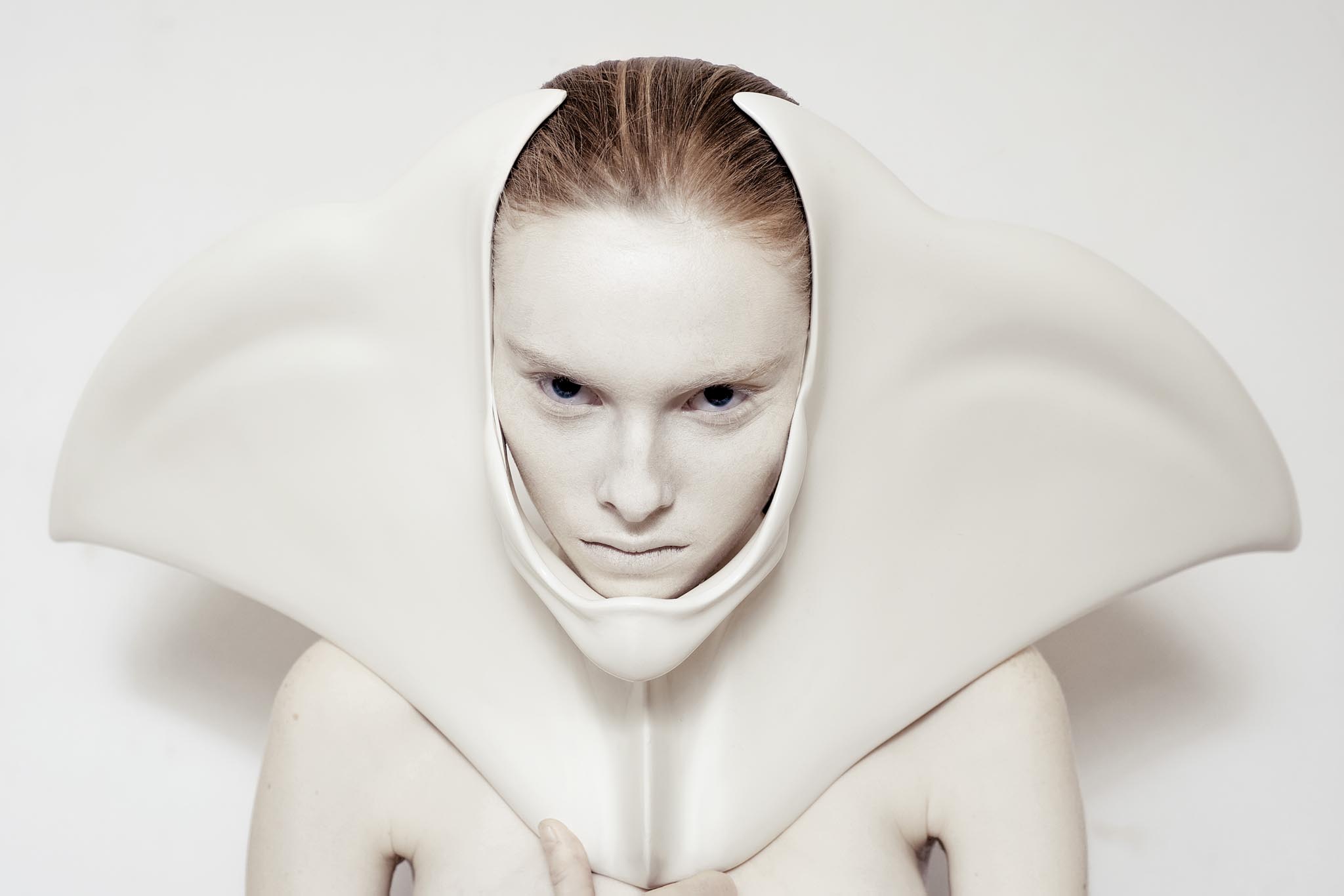
Ana-Rajcevic, photo by Fernando Lessa

Many of the objects at the biënnale are created by emerging designers rather than by established fashion houses (even though Prada, Vivienne Westwood and Jean-Paul Gaultier are represented, and a film of the Dior couture show S/S 2007 is showed as a sign of “nipponism” being a contemporary fetish). Edelkoort tells me that this is because the traditional fashion houses did not live up to the requirements of the exhibition, but the lack of designs by brand such as Givenchy, Versace and Maison Martin Margiela, otherwise a given considering the theme of fetishism, nevertheless raises a few questions concerning the selection process. Also, curating a theme of “nudism” by “using the colours of our own skin” but only including beige objects unfortunately enhances the Caucasian norm already strongly prevalent in Western society, as does the naïve statement (returning to “nipponism”) that, “Japanese people have an innate knowledge of how to package and fold geometry into form [...] it can possibly be considered the most fetishistic culture in the world, where each rule and move is codified and all aspects are about attachments.” This kind of simplification of an entire culture obscures the important Japanese presence in fashion rather than elucidating and explaining the many interesting interrelations between western and eastern influences and actors within the industry.

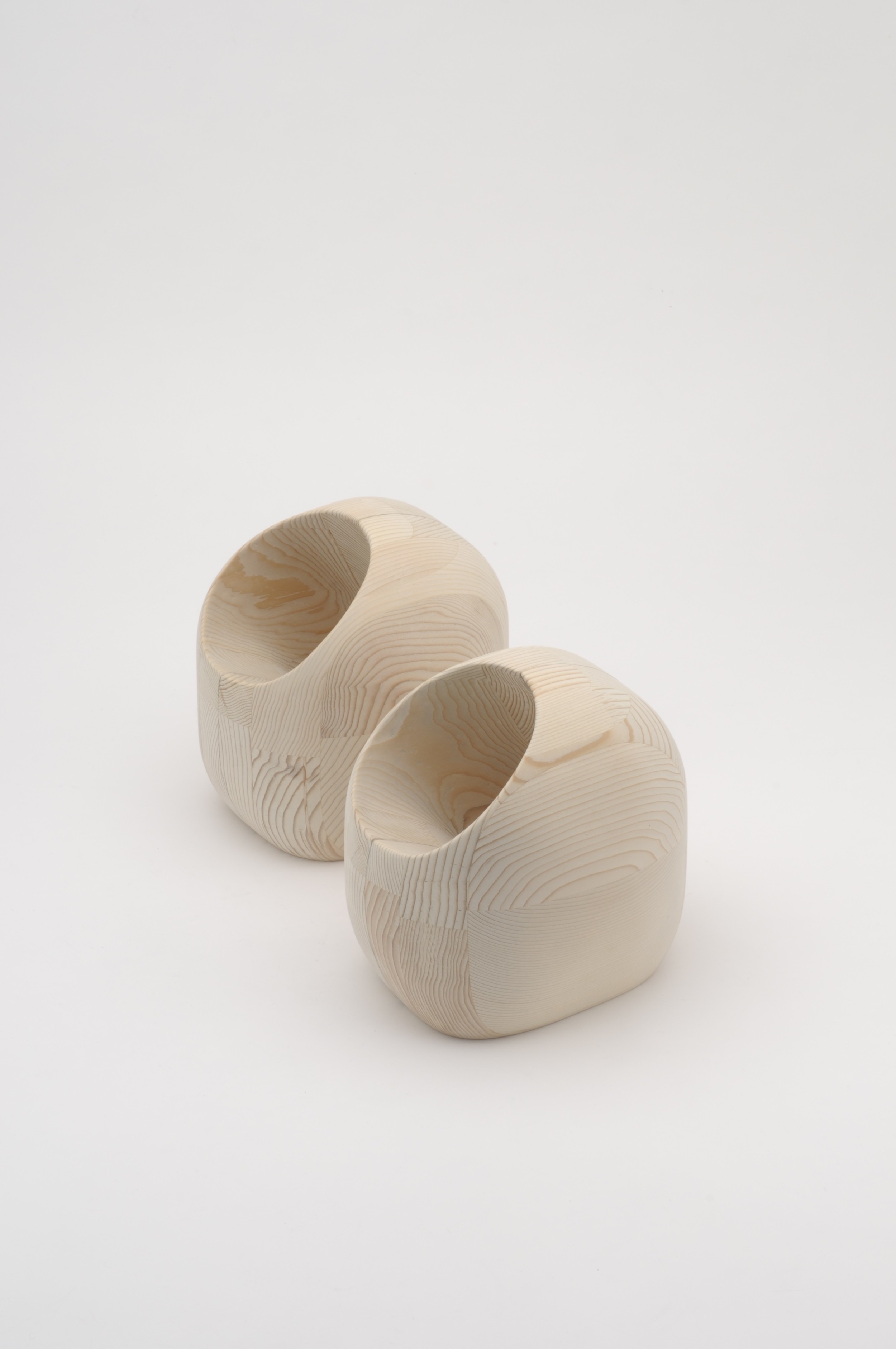
Edelkoort has been aided by a number of other designers, curators and artists – all in different ways connected to Arnhem and its ArtEZ Institute of the Arts – who in different ways have contributed to the biënnale. Under the fitting rubric “Elevation”, footwear designers Marijke Bruggink and Marlie Witteveen have investigated the central role of high heels in fetishistic fashion. In particular, their exploration of stilts and clogs is worth mentioning, demonstrating beautiful and intricate wooden constructions, with particular care given to displaying shoes that are actually possible to walk in. In a centrally located church in downtown Arnhem, the design duo People of the Labyrinths have been given free hands to construct an art installation, investigating the fetishistic position of fashion objects in comparison to relics, traditions and rituals within various religions. For example, a Catholic monstrance is placed next to Hermès’ Kelly-bag at the end of a long red carpet, while a neon sign spells out the words “make-believe” in the church ceiling. And in the Zypendaal Castle just outside of the city, menswear designers Ravage have curated an exhibition based on their fascination of style codes in menswear, focusing on objects such as underwear, shoes and neckties.

To briefly summarize, the 2013 biënnale combines an international perspective on mainly emerging designers with an explicitly Dutch team of curators. This gives the exhibition both global and local dimensions, creating tension in some areas while in others presenting humoristic approaches and in-depth explorations of how fashion can operate as a research tool in order to understand Western society’s ultimate fetishes.

Philip Warkander recently completed his PhD in Fashion Studies, and is currently working as a freelance fashion writer and consultant, while also teaching fashion theory and gender studies in Stockholm.

Yu Otaku, Clogs

A Review of "Punk: Chaos to Couture"

by Jay Ruttenberg Gallery View, D.I.Y.: Hardware

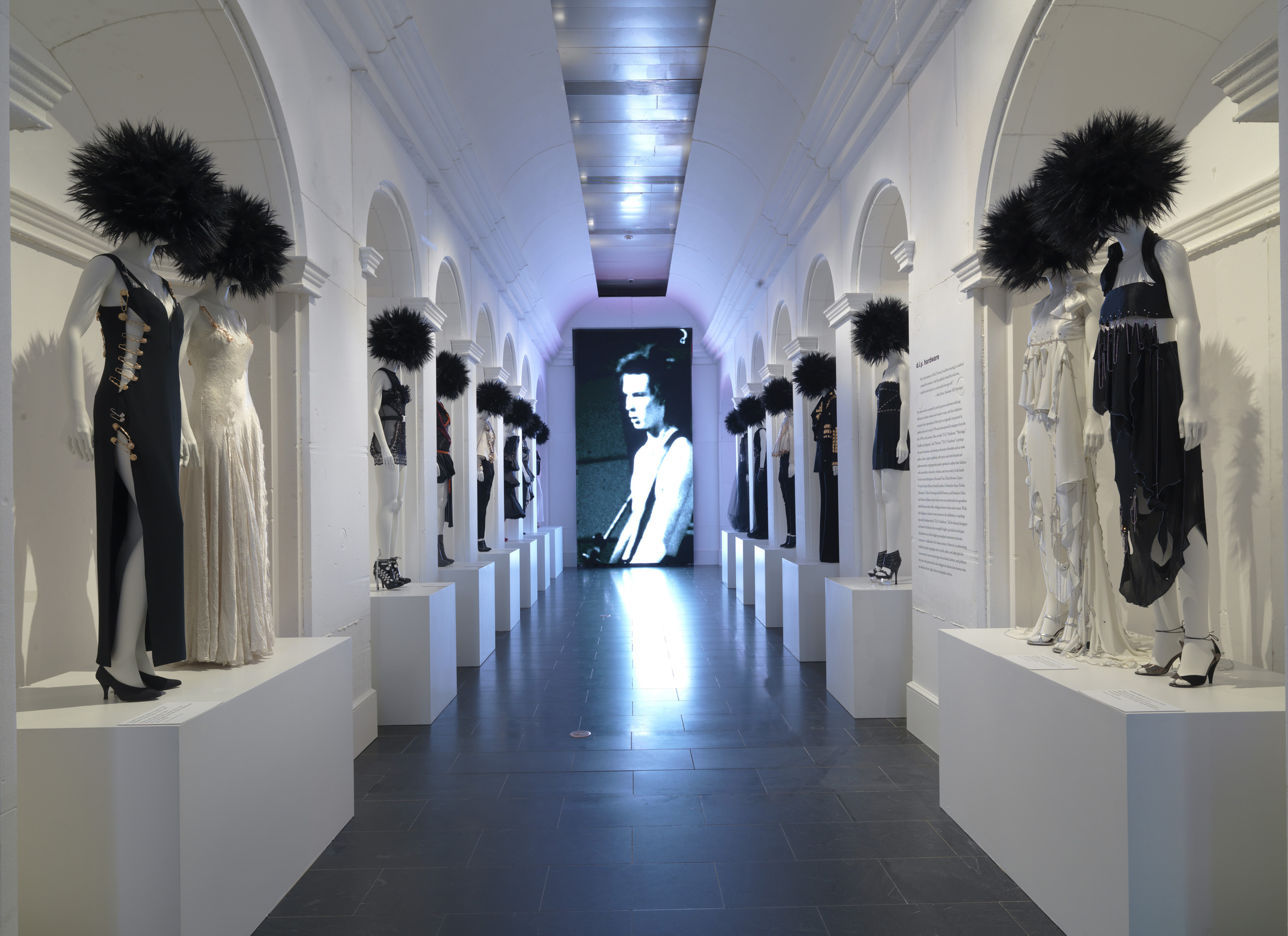
Punk fashion, in its purest form, is a gawky Jew from Queens, resplendent in old jeans, snug shirt, long hair, and a chintzy black leather jacket that, depending on the viewer’s perspective, either masks or accentuates the wearer’s geekiness. Anything beyond this uniform—the safety pins, studs, or those storied Mohawks—has always seemed an affront to the music’s minimalism. Worse, it is cheesy.

Or maybe not. Whereas in New York, punk was a witty music and art movement, in London, it quickly became a deathly serious fashion and media one. The Ramones gave their first concerts at a 23rd Street loft and a not-yet-famous Bowery dive bar; the Sex Pistols began their stage life at Central Saint Martins College, the London fashion hub. Hence, despite existing in the city that both birthed and perfected punk, the Metropolitan Museum of Art’s “Punk: Chaos to Couture” exhibition feels much more a piece of London than of New York. This is probably for the best: London punk never offered a rival to Joey Ramone’s pop persona or Tom Verlaine’s musicality—but then, New York did not produce image svengalis in league with Malcolm McLaren and Vivienne Westwood.

Refreshingly, the Costume Institute’s exhibition, curated by Andrew Bolton, devotes itself almost wholeheartedly to the fashion inspired by punk, predominantly womenswear made in the music’s wake. It never attempts comprehensiveness and avoids Hard Rock Café-isms. (Best to ignore the show’s biggest misstep: a dead-on-arrival, by-now-obligatory recreation of CBGB’s bathroom.) Excepting a room devoted to Westwood’s work—the sloganeering t-shirts of old circling the fancier items that followed—most pieces are from designers not typically associated with punk rock: Karl Lagerfeld, Miuccia Prada, Martin Margiela, Alexander McQueen…. Those punk aesthetes kvetching that the mere existence of this show somehow contradicts the music’s mission are missing the point (or, more likely, confusing the exhibition with Anna Wintour’s tone-deaf party). “Chaos to Couture” seeks to celebrate, not dabble in, cultural tourism. It is not about punk, but about fashion’s belated response to punk.

Gallery View, D.I.Y.: Graffiti & Agitprop

Rooms are divided by influence and material. “D.I.Y.: Hardware” represents the sordid mark of S&M, with gratuitous zippers, ominous padlocks, and other metals—bondage gear for the wealthy, basically. A snippet of the New York Dolls’s “Trash” spins in “D.I.Y.: Bricolage,” a room devoted to customization and recycled materials (i.e., a Margiela ensemble featuring foil and metal staples). The exhibition concludes with “D.I.Y.: Graffiti and Agitpop,” with the Clash as muse, and “D.I.Y.: Destroy,” which is inspired by Johnny Rotten and his awing collection of shredded grandma sweaters. For a viewer such as myself, far more schooled in songs than in garments, exploring how the genre eventually trickled into high fashion is eye-opening. In music, the best punk-influenced bands have always been those that channel elements of the genre into unexpected sounds (say, Beat Happening) rather than those producing mere facsimile. Ditto the more interesting clothing: McQueen’s skull and crossbones or a hokey Elvira get-up from Versace seem rote compared to, say, Moschino’s skirt of white plastic shopping bags, whose playfulness might have been appreciated by X-Ray Spex. A series of puffy cream Comme des Garçons dresses, at the show’s finale, reference the layers favored by punk kids only upon a second or third glance. The effect is striking.

As exemplified by that CB’s bathroom—and will some brave soul please take the Met’s bait and use the toilet?—the exhibition stumbles as it gets cute and veers away from fashion. The museum’s decision to identify famed designers laboring under multinational corporations as “D.I.Y.” is laughable. At times, the exhibition tries too hard to create a punkish aura—the “Graffiti and Agitpop” room resembles the menacing punk rock of a Hollywood backlot. And while it is impossible to be discontent while hearing “Blank Generation,” particularly along Fifth Avenue, the inclusion of background music diminishes the clothing it sets out to contextualize.

How this exhibition is received by New Yorkers remains to be seen. The show has yet to open, and already it has given us the cringe-worthy spectacle of insecure celebrities struggling to add hints of leather or metal to their wardrobes in order to qualify as “punk” for the Costume Gala. Perhaps such behavior flies in London; in New York…yeesh! It’s embarrassing just to think about it. For Chrissake, a punk wears what a punk wears.

A recovering rock critic, Jay Ruttenberg is editor of The Lowbrow Reader and its book, The Lowbrow Reader Reader. His work has appeared in The New York Times, Spin, and Details.

Designing the Second Skin: The Work of Giorgio di Sant' Angelo 1971-1991

by Francesca Granata Veruschka wearing Giorgio di Sant'Angelo, Vogue 1972, Photo: Richard Avedon

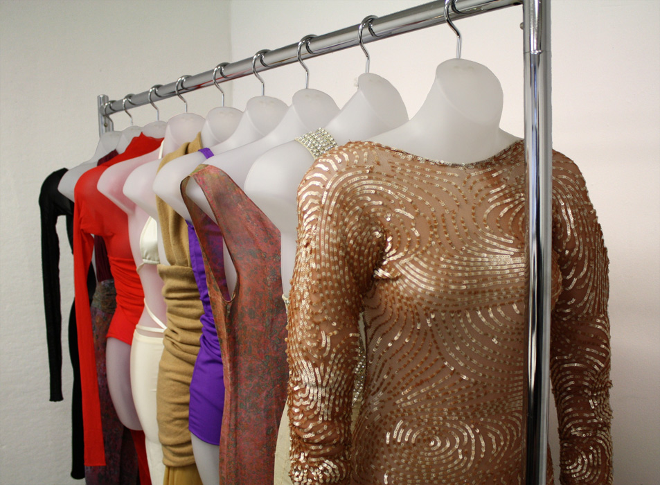
As part of my newish position at Parsons, I taught one of the most interesting and stimulating classes I have ever taught. For a course I developed, called Fashion Curation, graduate students from various programs--Fashion Studies, History of Decorative Arts and Design and MA in Architecture--curated an exhibition of the work of the late Italian-Argentinean designer Giorgio di Sant' Angelo in the Parsons Gallery at 66 Fifth Avenue, which is due to open December 4th. Focusing on his use of innovative stretch fabric, "Designing the Second Skin" is the first exhibition of the work of Giorgio di Sant'Angelo in New York. A special thanks goes to Martin Price, di Sant' Angelo's partner and collaborator, as well as to Tae Smith.

Below is the press release and a sneak preview of some of the garments that will be on view:

On Tuesday, December 4, the opening reception for "Designing the Second Skin: The Work of Giorgio di Sant’Angelo 1971-1991" will be held from 6 to 8 PM at the Aronoson Gallery on 66 Fifth Avenue. The exhibition is curated by graduate students in the MA Fashion Studies, MA in the History of Decorative Arts and Design, and Master of Architecture program at Parsons under the supervision of faculty member Francesca Granata. The exhibit will be on view until Friday, December 14.

Parsons presents the first New York exhibition of the work of designer Giorgio di Sant’Angelo, an innovative Italian-born American designer from the 1960s through 1980s who explored the ways in which garments truly become the wearer’s second skin. Playing with texture, transparency, and newly discovered fabric technology, Sant’Angelo examined the relationship between exposure and concealment. A highlight from the exhibition is a nude sequined jumpsuit worn by Naomi Campbell and featured in an editorial shoot for Harper’s Bazaar in 1991.

The works on view are drawn from the Parsons Fashion Archive—a collection of nearly 10,000 garments, including a number of pieces donated to Parsons by the Costume Institute at The Metropolitan Museum of Art. The Sant’Angelo works were originally donated to the Met by Parsons faculty member Martin Price, Sant-Angelo’s design assistant and partner, who has been an instrumental force in keeping Sant’Angelo’s spirit alive. Event Details:

Designing the Second Skin: Giorgio di Sant’Angelo 1971-1991 Dates: Tuesday, December 4 to Friday, December 14 Opening Reception: Tuesday, December 4 from 6 to 8 PM Gallery Hours: Open daily from 12 to 6 PM, open until 8 PM on Thursday Location: Parsons The New School for Design, Arnold and Sheila Aronson Galleries, Sheila C. Johnson Design Center, 66 Fifth Avenue Admission: Free and Open to the Public. Wine and Hors d’oeuvres will be served.

Ballgowns: British Glamour Since 1950

Victoria & Albert Museum, London, 19 May 2012-6 January 2013

Contemporary Ballgowns

by Jeffrey Horsley

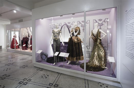
'Ballgowns: British Glamour since 1950' is the first temporary exhibition to be held in the Victoria & Albert Museum’s newly restored Octagon Court, a spacious gallery with a high, domed ceiling, long the home of the Museum’s Fashion Galleries. Curated by Oriole Cullen, Curator of Modern Textiles & Fashion, and Sonnet Stanfill, Curator of Twentieth Century & Contemporary Fashion, the exhibition comprises over 60 outfits by British-based fashion designers from the 1950s to the present day, combining items drawn from the Museum’s holdings alongside loans from designers. The exhibition is staged in two sections; ‘Ballgowns Since 1950’ on the ground floor, ‘Contemporary Ballgowns’ on the mezzanine level. The press release proposes that the sections evoke respectively ‘the excitement of preparing for a ball in a grand country house’ and ‘the glamour of the red carpet or a couture presentation.’

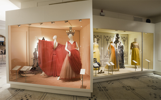
‘Ballgowns Since 1950’ is staged in a low-ceilinged space defined by large, fixed vitrines. Exhibits are organised chromatically, with cases themed to gowns in black and red, black and emerald, acid yellows, fawn and pinks, blues and ivories. This is a particularly effective strategy, exerting a visual harmony across garments from different periods designed for different occasions. Case interiors are painted a sympathetic pastel tone with either a matching carpet or black and white tile-effect flooring. Several vitrines have backgrounds of photographic reproductions of gilded panelling from the Music Room of Norfolk House, London. Many cases present two-dimensional, cut-out images of furniture and fittings evocative of eighteenth century English town house décor, with rear-mounted LEDs casting a glowing aura around each image.

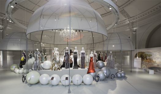
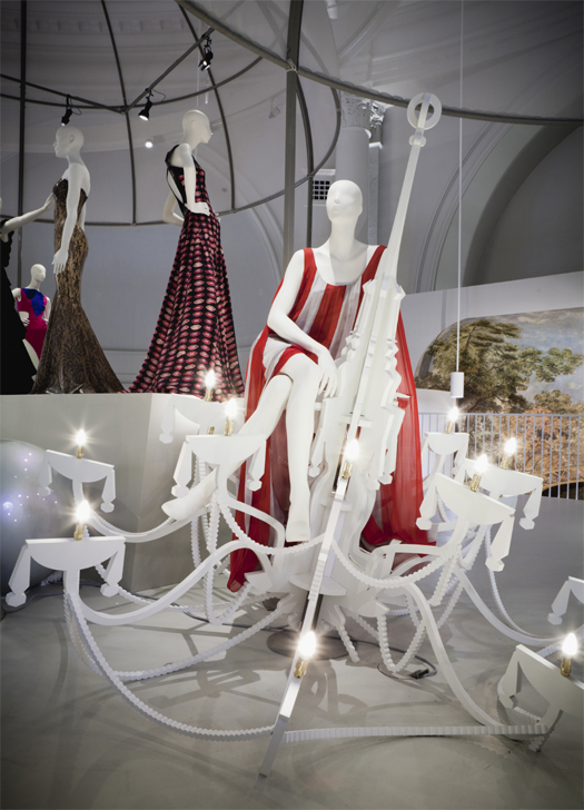
On the mezzanine level, a floor-plan unencumbered by fixed display cases and circumscribed by an open railing creates a gallery that appears to float beneath the expansive dome of the Octagon Court. Here, ‘Contemporary Ballgowns’ is arranged on three runway-like podia, each set under skeletal metal-framed cupolas clad with white net that echo the architecture of the gallery and hint at the bell-like skirt of the traditional ballgown. Inside each construction hangs an illuminated stylised chandelier, composed of flat, fret-cut panels. The podia are surrounded by strings of giant pearls with slowly revolving mannequins poised on several of the pearls.

Ballgowns Since 1950

Retail-type mannequins, finished in a pale-grey colour, without indication of make-up or hair-style, are used throughout. The mannered poses of the mannequins, often incongruous in exhibitions of more humble attire, appear fitting in the presentation of these extravagant outfits - their affected gestures conveying a sense of artifice that reflects the theatricality of the situations for which the gowns are intended. Notably, a striding mannequin, head held high and arms spread wide spectacularly displays a kaftan-like dress by Yuki, in raspberry-pink silk chiffon from 1972. Two further tableaux (reminiscent of the fashion photography of Tim Walker, who shot the image for the exhibition poster) are particularly effective; a mannequin in strips of red and grey silk chiffon, by Amanda Wakeley straddles a chandelier which has seemingly crashed to the floor; a figure wearing a pink and dark fawn silk satin gown by Hardy Amies languishes over a sofa which is represented as a photographic cut-out, with a pair of similarly rendered greyhounds adding to the chic elegance of the scene.

Ballgowns - Yuki

The schizophrenic qualities of the two exhibition spaces are a challenge to establishing a distinctive, unified atmosphere for the exhibition. The exhibition designer, Emily Pugh (trained as a window dresser at London’s Selfridges department store), manages to exert an aesthetic continuity through the application of a minimal colour scheme and repetition of the photographic cut-out device. Whilst achieving an impression of elegance the staging does not completely achieve the dynamic energy promised by the occasions it sets out to evoke. The ubiquitous pale grey and the two-dimensionality of the photographic props, coupled with the mannequins’ unflinching gaze cast over the visitor’s head, determines an overall effect of cool hauteur. The theatrical energy and social dynamics inherent in the locations of privileged interior and star-studded première the exhibition purports to replicate are sadly lacking.

Notably absent from the mise-en-scène are those supporting players whose attendance underlies narratives of class and gender. There is no male escort for instance, the tuxedo-wearing presence that represents both aesthetic foil (the ‘inconspicuous dark suit provides the ideal matt background before which “she” can really spring into life, with the brilliance of silk, the sparkle of jewels, the shimmer of naked skin’, as Barbara Vinken describes) and counter-part in culturally-specified gender roles. Additionally, there is no maid-servant, dresser or personal assistant, whose uniformly black-clad presence again provides aesthetic contrast and indicates narratives of class and wealth. Instead, the scenography realised for Ballgowns offers a cast of leading characters who shimmer, in alluring isolation, against ornamental backdrops.

Ballgowns - Amanda Wakeley

The scenographic concept and the curatorial narrative of Ballgowns propose complex socio-cultural settings without investigating those issues of class, gender, consumption and display inherent in the suggested scenarios. The gendered dynamics of events that, according to exhibition text panels ‘oblige the wearer to present herself at her finest’ and ‘leave little room for misjudgements of taste’, pass without critical comment. On the ground floor, the clothed mannequins are positioned alongside images of antique furniture and over-scaled precious jewels, apparently as comparable trophies reflecting wealth and connoisseurship. This scenographic juxtaposition appears to articulate the couture-clad woman as decorative ornament, to be displayed, collected and owned. As Vinken notes, ‘Thorstein Veblen characterized the woman of the nineteenth century…as mobilia, as the mobile property of her husband.’ Ballgowns side-steps the opportunity to engage with those potentially controversial but compelling and complex narratives that are embedded in the scenarios it presents. The exhibition strives to invoke, without criticism, a rarefied world where beauty is the great leveller. As the Italian couturier Valentino confides: ‘like I love a beautiful lady, like I love a beautiful dog, like I love a beautiful piece of furniture. I love beauty…it is not my fault.’

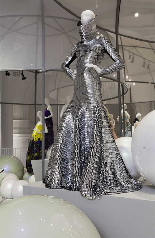
Even the symbiosis of glamour and celebrity that is central to the exhibition’s theme, yet which cultural theorist and author Elizabeth Wilson articulately proposes as ‘polar opposites’, is left unexplored by the curators - although not by the designers themselves. A striking gown by Gareth Pugh, for instance, provokes the viewer to reconsider the popular vision of red carpet glamour. Constructed from loops of silver coated leather that descend from a raised, eye-level collar to a floor skimming hem, Pugh’s ensemble stretches the conventional ideal of the ballgown to breaking point. Its shimmering, carapace-like appearance returns to the essence of Wilson’s notion of glamour as a scintillating, mystical, illusory force. This gown stands in emphatic contradiction to the notion of body (and soul) baring glamour that Wilson berates and that ‘red-carpet’ dresses often display. Pugh’s construction is exemplary, and representative of the tour de force design and execution that is the heart of Ballgowns.

Ballgowns - Gareth Pugh

As Gareth Pugh’s contribution illustrates, what is remarkable in this selection is how designers draw on the tradition of the ‘statement’ dress and transform it into a vehicle for technical experimentation. This is particularly evident on the upper floor, where gowns by McQueen, Galliano and Westwood are presented alongside inventive work from relative newcomers; Craig Lawrence’s nest-like concoction of knitted gold and silver foil; Nicholas Oakwell’s digitally-printed silk zibeline gown depicting swirling galaxies; Atsuko Kudo’s lace-printed floor length latex sheath. While the avoidance of engaging critically with contextual narratives might be levelled as a short-coming of the exhibition, the strength of Ballgowns lies in the undeniable quality and sheer invention of the designs on display. Ultimately, Ballgowns is a celebration of British design and craftsmanship and it offers a captivating and expertly edited cross-section of the best of innovative, extravagant British fashion.

www.vam.ac.uk/ballgowns

Text / Jeffrey Horsley © Images / Ballgowns: British Glamour Since 1950 V&A Images © Sponsored by Coutts

1Barbara Vinken, ‘Transvesty – Travesty: Fashion and Gender’, in Fashion Theory, Volume 3, Issue 1 (New York: Berg, 1999) 37. 2 Vinken, 37. 3 Matt Tyrnauer, Valentino: The Last Emperor (Toronto: Phase 4 Films, 2009). 4 Elizabeth Wilson, ‘A Note on Glamour’, in Fashion Theory, Volume 11, Issue 1 (New York: Berg, 2007) 95-108.

Innovative Exhibition Design Strategies for Cristóbal Balenciaga and Comme des Garçons at Musée Galliera

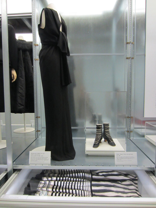
Balenciaga Cape du soir, 1963 and Collier c.1895

There couldn’t be a more unlikely exhibition venue than Aux Docks - cité de la Mode et du Design in Paris. At the other end of town from Musée Galliera's permanent home, which is currently under renovation, this temporary venue sits in a gritty industrial part of town overlooking the river Seine.  This contemporary space has exposed  concrete walls, punctuated by industrial pipes and has been the temporary home for the musée Galliera  exhibition of Cristóbal Balenciaga, collectionneur de modes and Comme des Garçons White Drama. Two adjacent long and narrow rooms served as the exhibition space. Bringing fashion into these blank, cold, industrial boxes must have been a curatorial challenge, since there is an apparent lack of temperature and humidity controls as well as absence of hangable wall space. Nevertheless, Olivier Saillard and his team of the Gallieria rose to the challenge with display techniques that are as innovative as they are creative and the result are two tightly curated exhibitions featuring selected works of two notable designers - Cristóbal Balenciaga, collectionneur de modes and Comme des Garçons White Drama.

Balenciaga Installation Shot by Ingrid Mida

In the first room, Cristóbal Balenciaga's personal archive of historical garments, print material and other artifacts is presented beside selected examples of his work. This personal archive was recently donated to the museum and  includes a range of items from the nineteenth century such as dresses, collars, corsets, shawls, mantles, capes, as well as fashion plates, books and journals. Set alongside Balenciaga's design work, the reinterpretation of fashion history for design inspiration is made evident. Key to the creation of this link is the innovative display techniques, incorporating modular drawers with clear protective insets, which sit underneath cube-like metal vitrines. The drawers are stacked in fixed position, but open, suggesting links between adjacent pieces. For example, beaded and embroidered black capes and mantalets from the late nineteenth century are shown alongside a Balenciaga cape du soir from 1960, and a 1945 jacquette de soir. The shapes, colours and beading techniques are remarkably similar, and creating links through time and history. Although there is minimal text, none is needed; the objects speak for themselves.

Balenciaga Exhibition, Installation Shot by Ingrid Mida

What I found startling about this exhibition is not the link of inspiration with creative result, but rather the creativity of display. Clothing is not only shown on conventional mannequins, but also presented in clear plexi-topped drawers, as flat storage in clear boxes, or hanging from padded hangers. The flat display in clear boxes offers a contemporary solution for delicate historic garments that might otherwise never be put on display, as well as circumventing the need for custom mannequins. The modular metal units have a slightly mirror like quality that creates a ghost-like reflection of the backs of the garments, as well as creating synchronicity with the industrial setting of the venue.

Comme des Garcons White Drama, Installation Shot by Ingrid Mida

The adjacent room presents Comme des Garçons White Drama an exhibition of thirty white garments by Rei Kawakubo in futuristic white plastic bubbles. Whether these bubbles were designed protect the garments from pollution or for artistic effect, the choice was an inspired one. Within the bubbles, between three to six blank-faced white mannequins wear white garments. Devoid of colour, except for a few pieces with hand-painted graffiti, the focus is on the sculptural elements created by draping, folding, sculpting, and crinoline-like additions to the forms.

Comme des Garçons Installation Shot by Ingrid Mida

Although Rei Kawakubo denies that what she creates is art, these garments are wearable art. With protuberances of crinoline-like skirt structures, webs of crochet, or bags of flowers, these pieces might be wearable, but not for by anyone with a wallflower personality. Donning such a garment would be suggestive of performance art. Adding to this impression of fashion as art are the unique headdresses “worn” by the mannequins. Created out of disparate materials, ranging from what looks like could be white steel wool, pillowcases or spray on Styrofoam, these headdresses act as sculptural elements unto themselves. The overall effect is futuristic and surreal.

Balenciaga Installation Shot by Ingrid Mida

Some have argued that fashion becomes art when it is presented inside the context of a museum. In absence of conventional museum space, the curatorial team of the Galliera has used innovative presentation techniques within an industrial space that redefines exhibition design strategy. A pristine white box is no longer a prerequisite and in fact, it seems that embracing the challenges of unlikely and difficult spaces can offer opportunities for curatorial and exhibition design innovation.

This exhibition ends on October 7, 2012. For more information, visit 

http://www.paris.fr/loisirs/musee-galliera/exposition/