Zero + Maria Cornejo Fall 2008

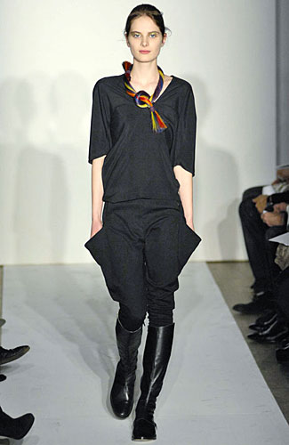
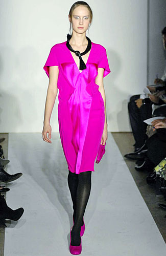
Zero + Maria Cornejo Fall 2008 (Photo from New York Magazine)

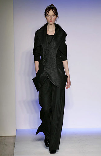
Maria Cornejo showed her keen understanding of garments’ construction partially achieved through a mastery of fabrics in her Fall 2008 collection. She divided the shows in five colour groups: “Red and Black and Check,” “Chalk and Grey,” “Black and Flourescents,” “Nomad Multi Colors” and, finally, “Midnight Evening.” Through her precise use of pleats, gatherings and folds—or to use her terminology “origami” techniques—the looks read as effortlessly chic, while the collection displayed a great ratio of black to vivid colours.

A particularly exciting moment was the satin fuchsia dress she sent down the runway at mid-show, which literally seemed to emanate light, as well as a more sportive look at the other end of the colour spectrum comprised of black jodhpurs and a simple black top. Also of notice were the horse hair necklaces which decorated many of the clothes (and were often dyed to match them). Reminiscent of actual hair and loose tresses, the necklaces added an interesting sexual punctum to the restrained sensuality of her work. Ultimately, what makes Cornejo’s work stand out—especially on this side of the Atlantic—is her ability to combine a level of simplicity (or perhaps clarity) with wearability and experimentation—a rare feat which few designers can be said to achieve.

Francesca

Three as Four, Fall 2008

Three as Four, Fall 2008 (photo from New York Magazine)

I found it hard to be won over by the Three as Four show, as I personally thought the abundance of black made some of the intricately cut and intelligent pieces look less appealing and somehow slightly dated. (I can’t help but strongly associate all-black-looks with a 1990s idea of elegance and avant-garde.) What I found most interesting was the sharply tailored trench and vests, which were constructed around elongated oval shapes that left the sides open. Curved shapes returned in the rouched skirts and the interestingly rosette-like rouches at the hems of some of the dresses. Also appealing was the grey wool lurex fabric used for the outerwear, which combined elegance and experimentation.

Francesca

Patrik Ervell Fall 2008

Patrik Ervell Fall 2008 (a look vaguely reminiscent of Ian Curtis)

The Patrik Ervell menswear show had a modernist vibe, as it took place in the Pier 59 studios. The space was a white cube with huge windows overlooking the Hudson, and the runway floor was covered in gold reflective paper which recalled the fabric of the looks at show’s end. I was reading T’s blog account of Ervell’s show as awash with art and music types and was impressed with T editor Horacio Silvia’s ability to recognize the members of Grizzly Bear and Hot Chip. I believe I have seen both bands in concert and yet have no recollection of what they look like.

The clothes seemed precisely tailored and clean in a way that was not at all boring, but rather subtly researched. That, combined with the skinny silhouette, was reminiscent of Raf Simon’s work. I most enjoyed the first part of the show, with the more muted color and particularly the navy looks which went really well with the simple canvas shoes. Also interesting were the double-hooded looks, as well as the final looks which were articulated around gold synthetic fabrics. The reported presence of band members and art types in the audience seemed to have been in tune with the vibe the clothes gave out which—at least according to Jay, who gave me a live commentary—reminded him of: “A Wes Anderson movie extra,” “a member of Blur circa early 1996” and “Ian Curtis shortly before he hanged himself.”

Francesca

Rachel Comey Fall/Winter 2008

Rachel Comey, Fall/Winter 2008 (photo from New York Magazine)

The Rachel Comey show is that rare instance of a fashion show which reads as welcoming and laid back yet sophisticated, as it took place on the parlor floor of a town house (the Salmagundi Art Club). The setting and the mismatched couches gave one the impression of being in the living room of someone’s eccentric old relative. (While there, I couldn’t help but thinking of the Chelsea, London, house of the uncle character in Withnail & I.) The clothes were also artfully mismatched, as they juxtaposed an array of whimsical and lightly funny prints and slightly clashing color combinations. The use of turbans and the choice of prints were reminiscent of the 1940s, while the silhouettes were elongated almost lanky due to some short jackets and high waisted skirts and pants and the result was attractive in a nerdy eccentric way. Particularly interesting were some of her knit dresses and quilted jackets, as well as the footwear—particularly the oxfords and the platform shoes. (hand-painted book titles were written on some of the platforms, while some were checkered.) The music, together with the model’s deep under eye shadow, gave a slightly eerie feel to the looks and the presentation more generally. (One which was, however, slightly overshadowed by the fact that I was facing Lynn Yaeger, who is the unquestionable master of a certain doll-like off-kilter look.)

Francesca

Interview with Kaat Debo; "Bernhard Willhelm: Het Totaal Rappel"

The Mode Museum in Antwerp recently presented a comprehensive retrospective of the work of the German, Belgian-trained designer Bernhard Willhelm. Titled "Bernhard Willhelm: Het Totaal Rappel" (Total Recall), it marked the designer’s donation of his entire archives to the museum.

Following MoMu’s common practice of enlisting the designers themselves as curators, the exhibition articulates Willhelm’s aesthetics across its scenography, which was completed by the Swiss artists Taiyo Onorato and Nico Krebs. Curated by Willhelm in collaboration with the museum’s artistic director Kaat Debo, the exhibition presented his various collections separately. Each collection was staged in an environment which Onorato and Krebs built specifically for the exhibition, starting with the visuals contained in the respective lookbooks. Via its elaborate installation, Het Totaal Rappel underlined the collaborative spirit inherent in Willhelm’s approach (and in the creation of a designer house and its style more generally) by featuring works by artists who are the designer’s long standing collaborators alongside Willhelm’s own.

Upon visiting the museum this past month, I was given an informal yet very informative tour of the exhibition by MoMu’s artistic director Kaat Debo. What follows is an abbreviated and illustrated transcript of the tour. If you miss the exhibition, the extensively illustrated catalogue can be found (in North America) at Ooga Booga.

KD: The way Taiyo and Nico work with the scenography is an extension of their own work. For the installation they worked a lot with throw-away materials, left-over materials. That’s probably one of the reasons he [Bernard Willhelm] invited them, because their work has lots of similarity with his work. Bernhard is also very interested in trash and throw away materials…

KD: We presented each collection in separate installations. We didn’t mix collections. We tried to keep the collections together. For most of the installation, Taiyo and Nico started with the idea of the look book. For this collection [Spring/Summer 2003] the lookbook conveys the idea of building houses and of constructing weird houses with left-over materials. For the exhibition, they created a sort of old attic…

FP: It also looks like a shanty-town.

KD: It’s also interesting how in his earliest collections there were a lot of nature or flower motives. Nature was really inspiring to him. When he was a child, he was very interested in biology and chemistry.

Protest Room, Autumn/Winter 2002/2003, All Photos: Ronald Stoops, courtesy of MoMu

KD: And for this one [an installation identified as Protest Room, where Willhelm’s Spring/Summer 2003 collection is housed] Taiyo and Nico created hybrid figures: this mannequin has four legs and that one two upper bodies and four legs and arms. [They are holding placards with misspelled sentences and literally translated proverbs.] All of our staff was free to paint slogans and everybody was painting and it was an interactive experience.

KD: Here we had the toy train [going through the mountain-like structure]. It had a camera at its front and it made a recording of what it saw, but it’s not working at the moment. Girl with Mobile Phone Collection, Autumn/Winter 2006/2007

Inside the cave-like structures various collections were shown. The walls were covered with toy animals. The toy animals were placed in explicit sexual positions

FP: I love the lewd toy animals!

KD: And then there are the writings like in public toilets [which Bernhard asked the staff to write]. We are now in the “Girl with Mobile Phone Collection” (Fall/Winter 2006). This collection was inspired by Shibuya—a shopping neighborhood in Tokyo, where girls are dressed in extreme style. One of the trends that were popular at the time this collection was conceived was the “ganguro” girls. [“Artificially sun-tanned with pale lipstick, brightly coloured eye shadow and sporting a cellular phone.”]

Tiger Collection, Autumn/Winter 2005/2006

KD: And here you see a cardboard mountain that Taiyo and Nico made for one of his [Willhelm’s] collections.

FP: So they did work with Willhelm before. It’s great how he often collaborates with artists in his work.

KD Yes, I also think he collaborates with them in interesting ways. They try to find similarities between his work and their work and then they make something new.

KD: This is Bernhard himself. Pointing to a print from his Tiger Collection (Fall Winter 2005) depicting a photograph of a 19th century wall clock with the designer himself as a small decorative figure in black makeup and with a skirt of golden banana leaves.

FP: He is in black face…The prints seem a revisitation of colonial motives.

KD: Yes, but Bernhard also often disguises himself. Here he is supposed to be a black chief. In another collection he dressed as a 1970s porn-star. There is one picture where he is dressed like a Tyrolean guy…

KD: This print is also nice. It is a picture of all the people who worked with Bernhard at the time, all of his all staff, and they made a print of it, using the African tradition of the wet print…

Often what he does is not really explicitly political. For instance, in this next collection [Spring/Summer 2006, titled “I Am the One and Only Dominator”] there is a stars and stripes motif. Yet Bernhard would never in an interview say anything anti-American. When I asked him about it, he said: “Well everybody looks good in stars and stripes.” I like the way he is never explicit in his statement…

This [referring to the display of the Spring/Summer 2006 collection] was one of his first ideas. “I want these seventies mannequin guys with their pants down,” he asked.

FP: He was on the first cover of Butt, wasn’t he?

KD: And the model in the photos at the end of the exhibition is a very famous French porn star François Sagat.

Tirolean Room, Spring/Summer 2007

KD: This is the Tyrolean collection. Hingeborg [Harms] wrote about the construction of this collection in her essay for the catalogue. If you see the pattern of these kinds of dresses they are following traditional pattern making traditions.

This instead is an installation, that Taiyo and Nico had done prior to the exhibition. The sound is Yodel music. The artists are from Switzerland and Bernhard is German. Yodeling is a tradition against evil spirit. They [the Yodelers] go in little groups from farm to farm. This installation is also made primarily of recycled material.

Here instead is an installation by Carmen and Elle [Carmen Freudenthal and Elle Verhagen]. They are responsible for most of Bernhard’s lookbooks.

Trashed Room, Autumn/Winter 2004/2005 “The collection is presented in an installation of a teenager’s bedroom which has been completely destroyed by three girls. A video recording of the trashing session is included in the presentation.”

KD: We had the video two days before the opening and the girls had chain-saws and I was so scared they would hurt themselves. Bernhard wanted two girls with a punk gothic look. So, we asked one of the girls who worked here and has that kind of look to come and be in the film, and she recruited another girl.

Collection inspired by traditional attire of the black forest, Autumn/Winter 1999/2000

This is the very first collection. The hats are based on traditional hats and the blouses are very tailored. Sometimes people don’t really realize it, but his clothes are always well made and his patterns are really very thought-through, but you don’t often see it. You notice it when you wear it. Whenever we dressed a mannequin, it always worked very well. The blouse has a little monkey in the color of the coat. Bernhard’s label is the hand of a monkey. He had a toy monkey when he was little, so he uses the hand of the monkey for each collection. Also supposedly he is referring to the name of the city. There is a myth that the name Antwerpen comes from Ant Werpen throw-a-hand, because in the Middle Ages, Antwerp was threatened by a giant who didn’t allow the ships to come through. There was a hero who cut out the hand of the giant and threw it in the river, so Antwerp was saved from the giant, and thus the name.

This is the custom he made for Bjork for her new album cover. He made the wardrobe for her tour and also for her brass bands.

This is the superman collection (or superwomen rather). That mannequin has a neoprene skirt with a diamond motives on it and it’s displayed flying hung from the ceiling. It was really hard to install, but this way you understand his world better.

This other collection was inspired by cocaine, amphetamine, and black style. In the look book there is a cocaine dealer. In the Olaf Breuning video [which he made for the Spring/Summer 2004 collection] he also used some drug references. Some people were quite shocked by it. Francesca Granata

Ghosts, Spring/Summer 2004 (Staircase to the exhibition)